User Guide
Welcome to the User Guide. This document provides a complete overview of the main features available in the online version of the application. Whether you are a new user or simply need a quick refresher, this guide is designed to walk you through each step.
Table of Contents
1. Results Analysis
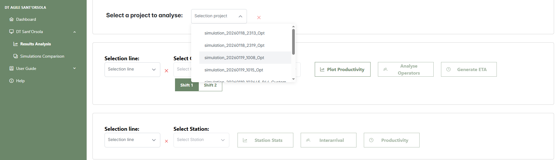
From the main AgileHand dashboard, click on DT Sant'Osola in the left sidebar to open the dropdown menu. Select Results Analysis to access the screen where previously saved simulations can be reviewed. In this section, click on Load Project to load the desired project. Once loaded, you can compare the forecasted demand with the production capacity, analyze operator and station performance, and evaluate order fulfillment times based on customer data.
Once loaded, the production line configuration appears in the Input Parameters section. This table provides the following information for each line:
- Shift Information: for each of the two work shifts, "Shift 1" and "Shift 2", the following details are shown:
- Line: the identifier of the production line.
- Combination: the number of operators assigned to the line.
- Crates: the number of crates assigned to the line.
- Work Time: the planned working hours for the line.
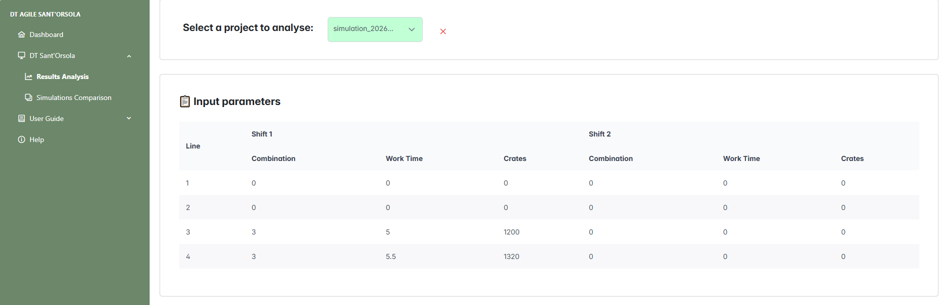
With the simulation loaded and the line configuration visible, you can proceed to explore all available results. The operator can now analyze operator and station performance, compare demand with production capacity, and evaluate order fulfillment times for each customer.
- Selection line - Select the production line from the available options.
- Shift 1 / Shift 2 - Before selecting the operator to analyze, choose the appropriate shift using the Shift switch. This enables the configuration view for the selected shift.
- Select Operator - Choose an operator or select "All" to include all operators.
- Select Customer - Choose the expected arrival time of the order for a specific customer.
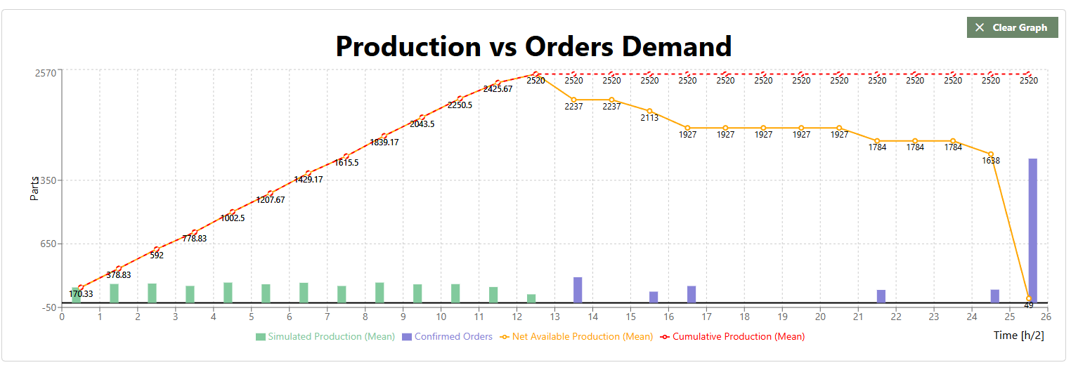
- Plot Productivity - Generates a chart comparing simulated productivity with required demand.
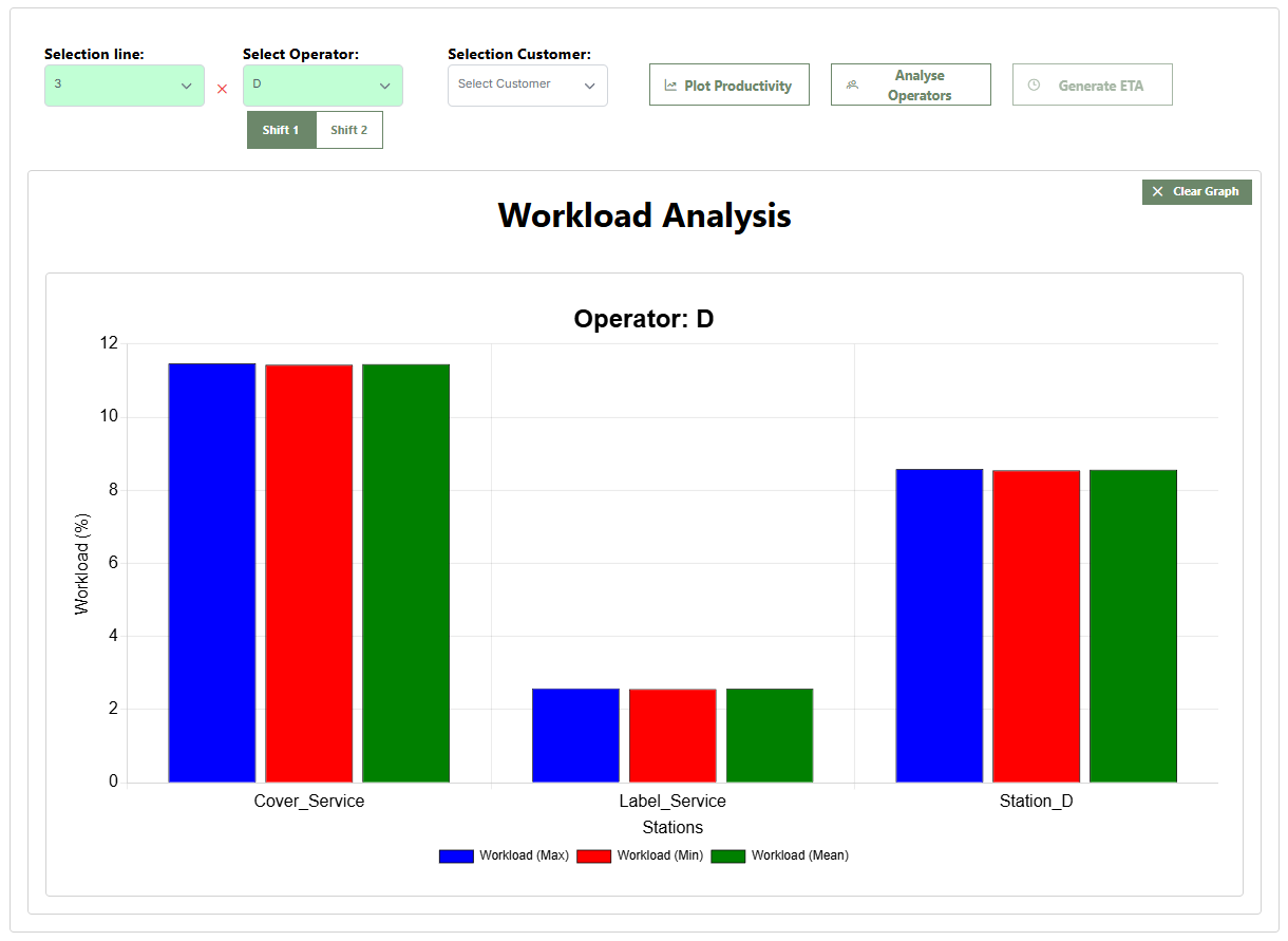
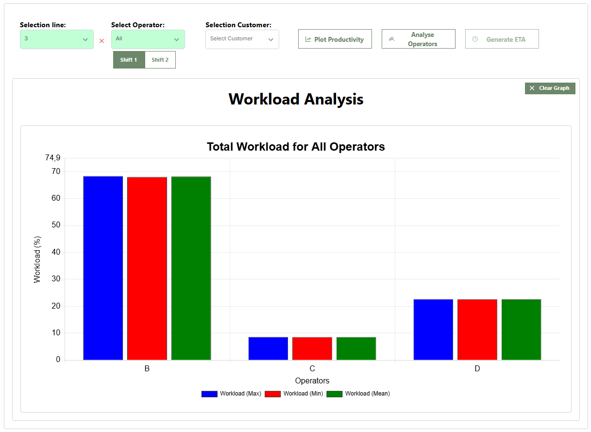
- Analyse Operators - Displays a bar chart of operator workload.
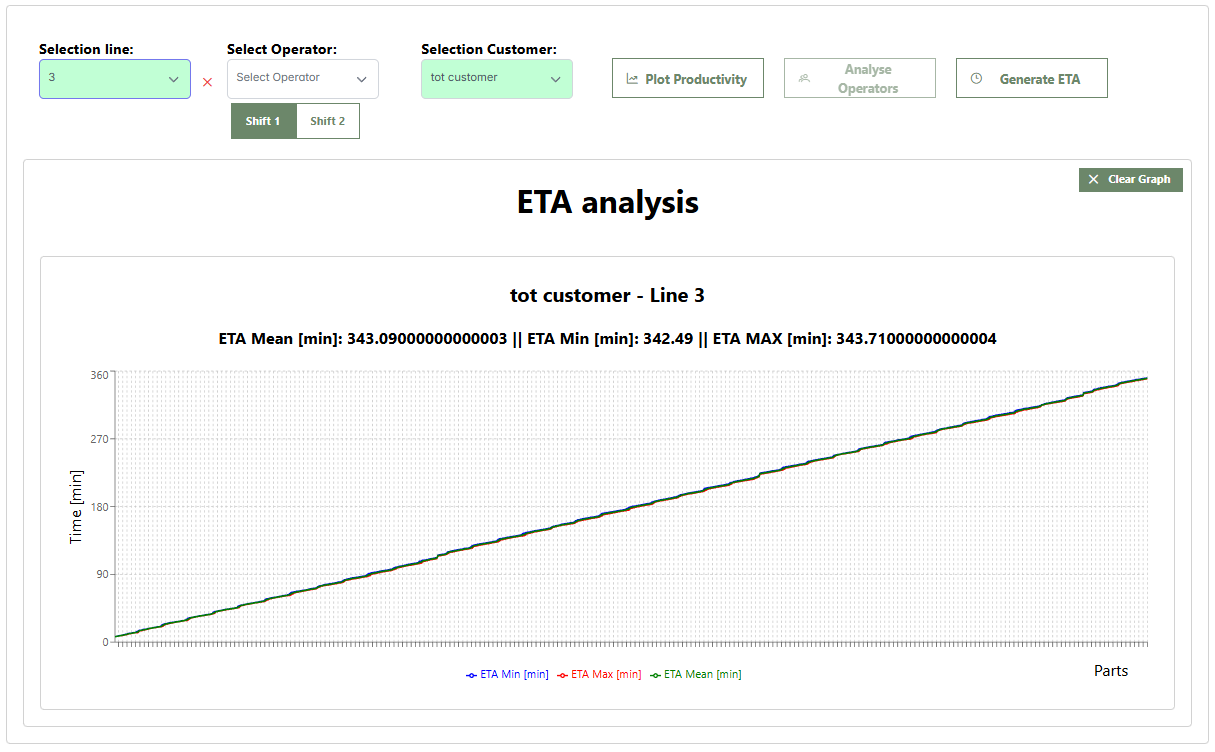
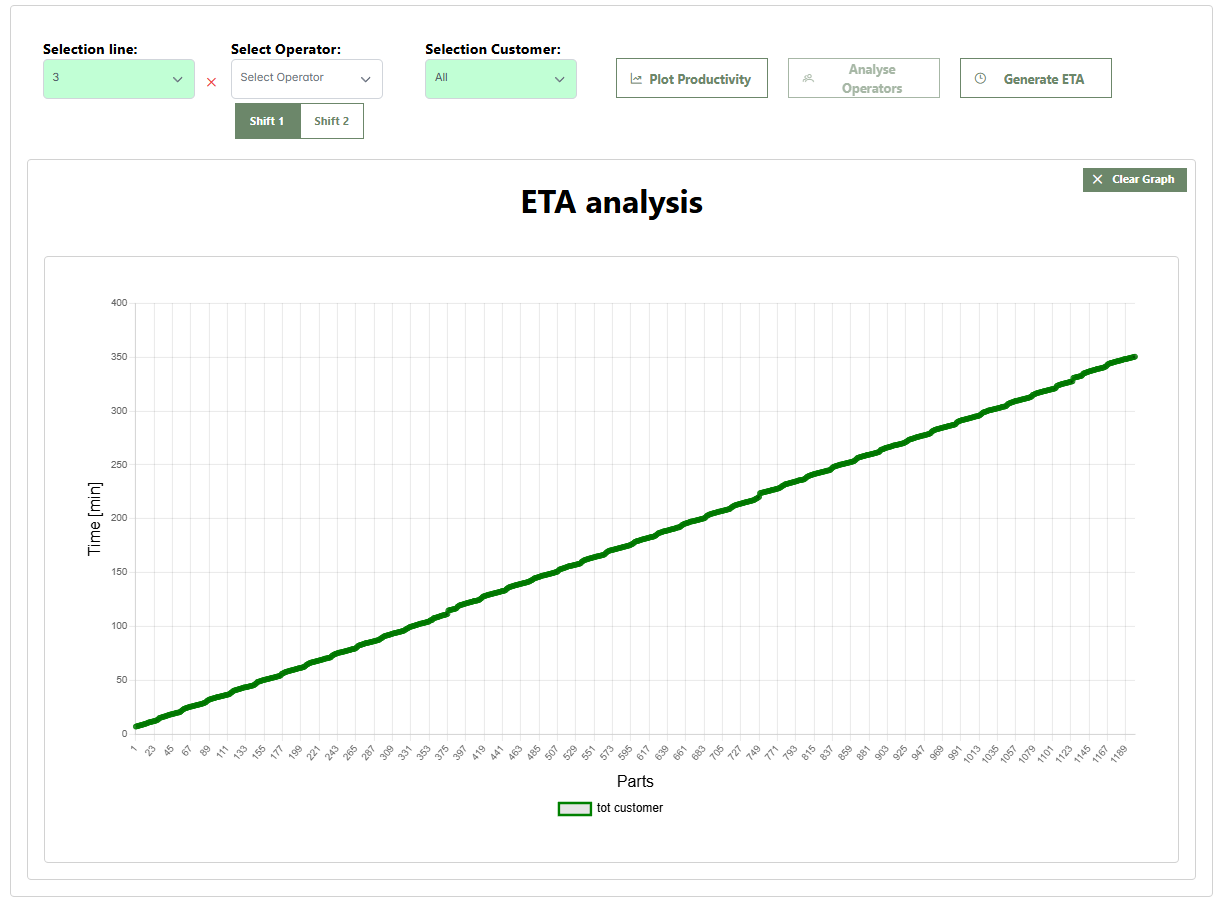
- Generate ETA - Shows order fulfillment times based on customer data.
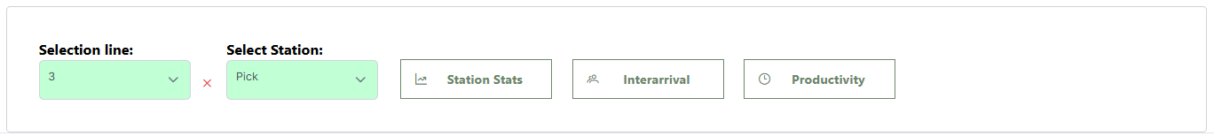
- Select Station - Select a station assigned to the chosen line or select "All".
- Station Stats - Displays a table with station statistics.
- Interarrival - Shows product interarrival times at the station.
- Productivity - Displays an hourly productivity chart for the station.
1.1 Productivity Analysis
The Plot Productivity button opens the Production vs Orders Demand chart, which provides a combined visualization of production performance compared to confirmed demand. The chart includes the following elements:
1.2 Operator Analysis
To view operator workload, the user must first select the line and the shift to analyze (Shift 1 or Shift 2). Only after these selections can the operator be chosen, at which point the Analyse Operators button becomes enabled.
1.2.1 Selecting a Single Operator
The bar charts (average in green, minimum in red, and maximum in blue) show the operator’s workload percentage across the assigned stations. Hovering over a bar displays the workload percentage for that specific station. In this example, Operator D from Line 4 has been selected. The charts show workload across the assigned stations: Cover_Service, Label_Service, and Station_D.
1.2.2 Selecting "All"
When selecting the All option in the operator menu, the overall workload percentages for each operator are displayed. Hovering over a bar shows the total workload percentage for that operator on the selected line.
1.3 ETA Analysis
To view order fulfillment times, first select the line and then the customer. Only then will the Generate ETA button become enabled.
1.3.1 Selecting a Single Customer
This screen shows the Estimated Time of Arrival (ETA) analysis for a specific customer, in this case tot customer for Line 3. The lines show the progress of order fulfillment, indicating how production evolves over time to reach the required customer quantity. The curves represent ETA values (minimum in red, maximum in blue, and average in green).
1.3.2 Selecting "All"
In this example, the All option has been selected in the customer menu. The chart shows the average arrival time at the end of the line for each product, grouped by customer.
1.4 Station Analysis
The second area of the page allows the user to select a line and a station. Only then will the Station Stats, Interarrival, and Productivity buttons become enabled.
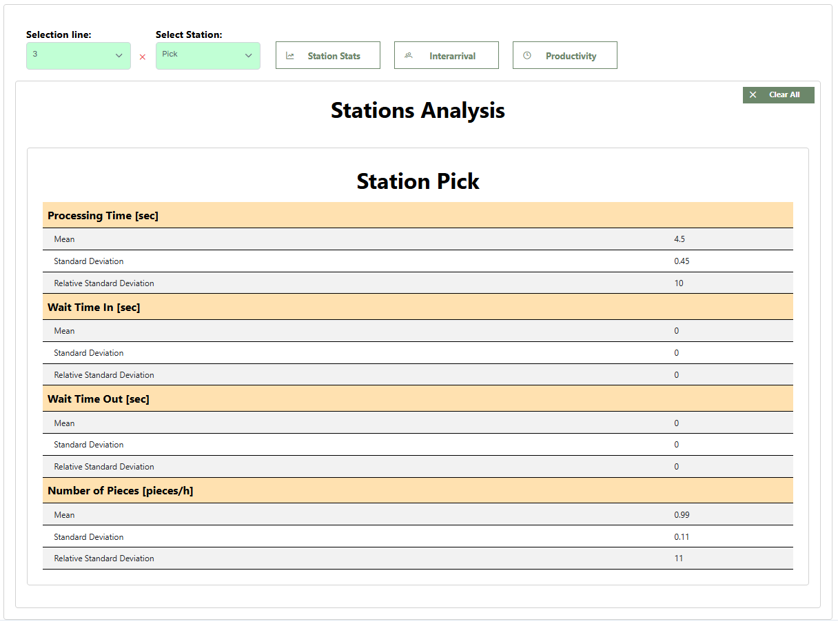
1.4.1 Station Statistics
The report provides data on the station’s operational performance, including process time, input waiting time, output waiting time, and the number of pieces processed per hour.
This image shows the statistics for the P-pick station on Line 3.
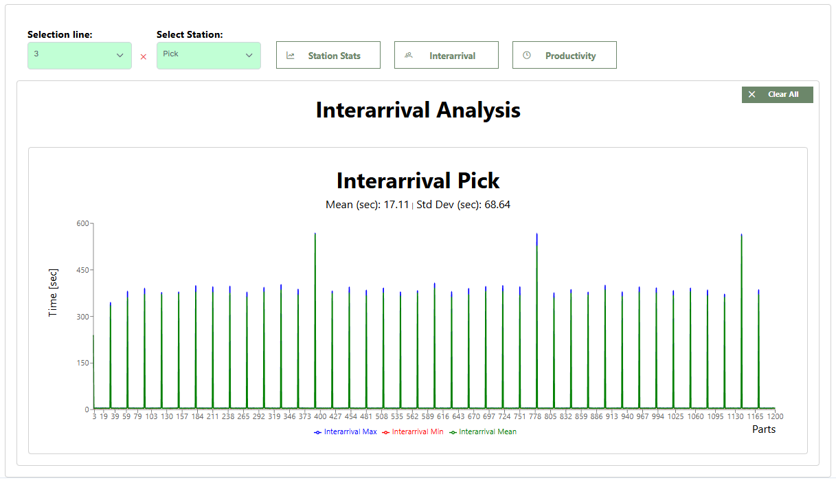
1.4.2 Interarrival
Displays the Interarrival analysis, monitoring the time between the arrival of one piece and the next.
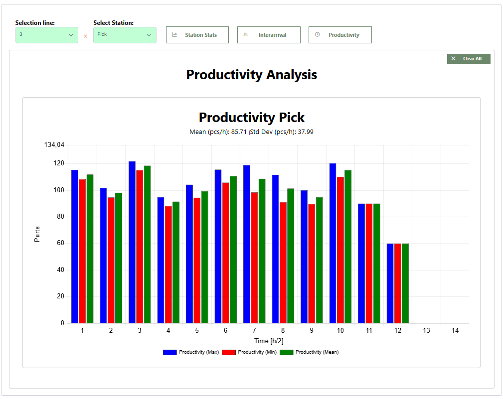
1.4.3 Productivity
This section monitors the number of pieces produced every half hour by the station, evaluating its overall efficiency. The chart displays maximum, minimum, and average productivity values.
2. Simulation Comparison
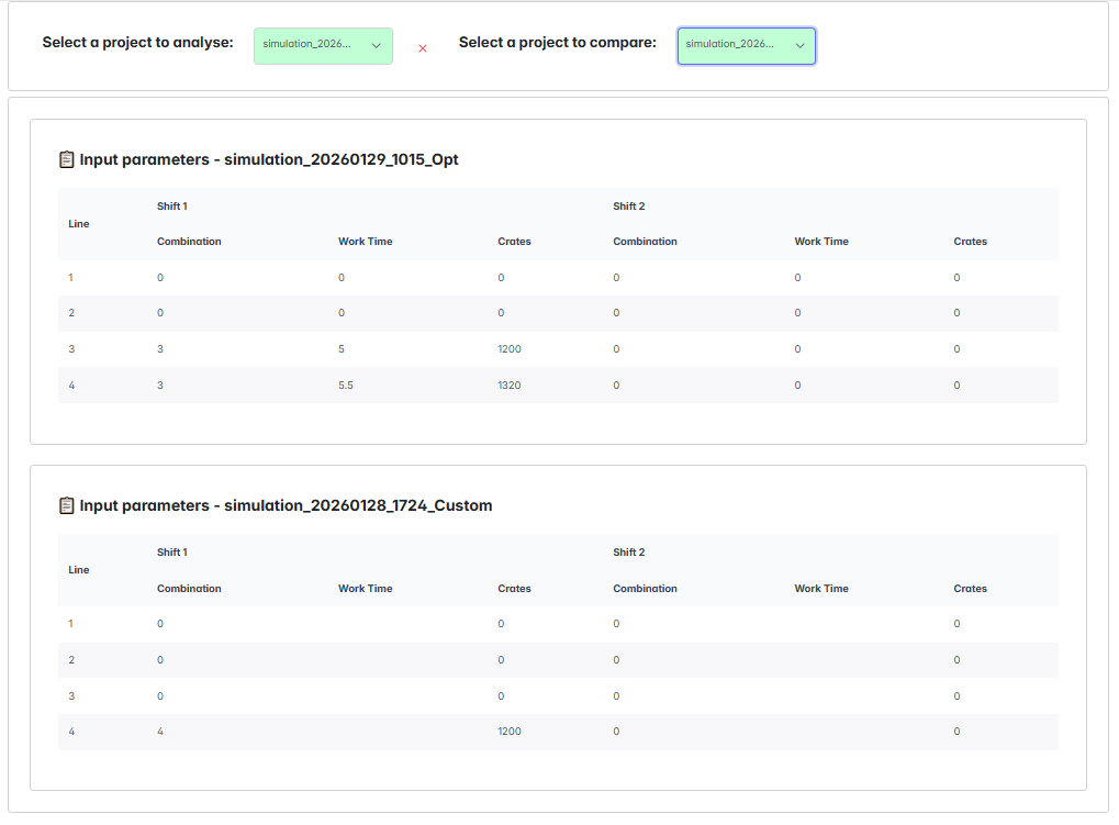
You can find this tool in the AgileHand dashboard, inside DT Sant'Osola in the left sidebar. Select Simulations Comparison to simultaneously analyze two previously saved simulations. In this section, click Select a project to analyse to load the main project. Afterwards, you can select the project to use as a comparison against the main one.
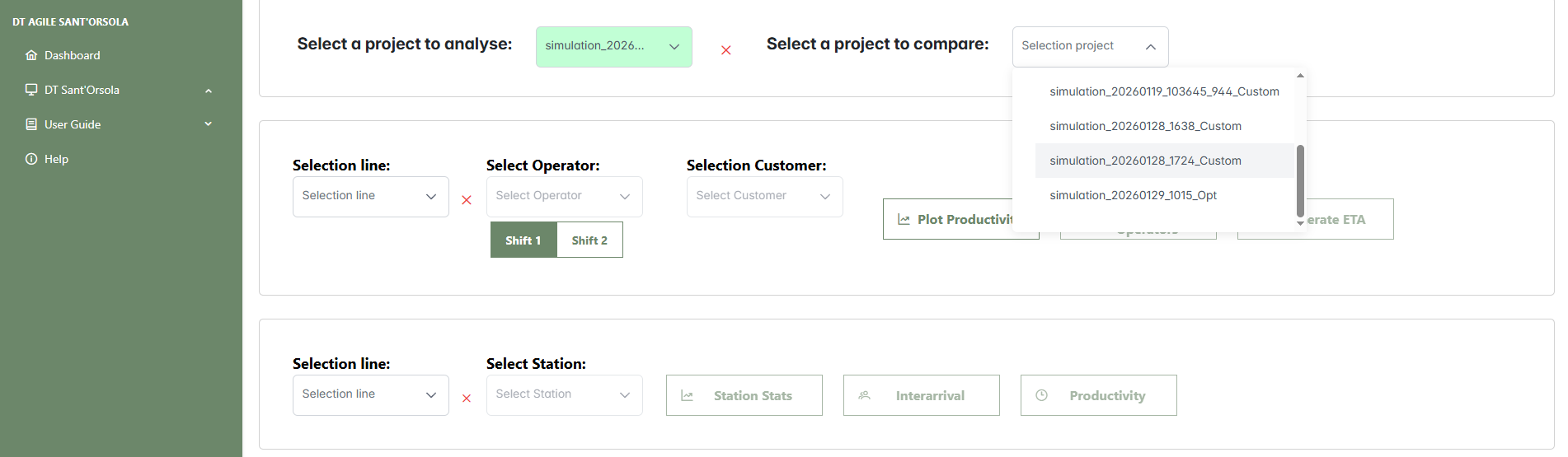
Both Select a project to analyse and Select a project to compare open a selection panel where you can browse through folders containing saved simulations.
Once loaded, the production line configurations of both simulations will appear in the Input Parameters section. These tables provide the following information for each line:
- Shift Information: for each of the two work shifts, "Shift 1" and "Shift 2", the following details are shown:
- Line: the identifier of the production line.
- Combination: the number of operators assigned to the line.
- Crates: the number of crates assigned to the line.
- Work Time: the planned working hours for the line.
With both simulations loaded and their configurations visible, you can proceed to explore all available results, as described in Section 1. Results Analysis. The operator can now compare operator workload, station performance, demand vs production capacity, and order fulfillment times for each customer.
Question?
If you have a question for us, use the link below to submit it. You will help us solve your issue and at the same time contribute to building the FAQ section to support other users.
Submit your question